override fun onCreate(savedInstanceState: Bundle?) {
    super.onCreate(savedInstanceState)
    setContent {
        VideoTheme {
            CallContent(call = call)
        }
    }
}VideoTheme
The VideoTheme component is a wrapper that you should use as the root of all Compose Components. It’s used to provide the default properties that help us style the application, such as:
- isDarkMode: Flag that determines if the application should be themed in light or dark mode.
- Colors: Defines a palette of colors we support in the app. These are applied to all components and provide us with a dark/light mode by default, but can be used to override the design system completely.
- Dimens: Used for defining the dimensions of various components such as avatars, call controls, video overlays, etc.
- Typography: Used for all text elements, to apply different text styles to each component. Can be used to change the typography completely.
- Shapes: Defines several shapes we use across our Compose components. Can be used to change the shape of avatars, dialogs, call controls, etc.
- RippleTheme: Defines the appearance for ripples. Can be used to override the ripple colors used in light and dark modes.
- ReactionMapper: Maps the emoji codes that come from the reaction events, should be shown with Stream UI components.
In case any of these properties are not provided, because you’re not using the VideoTheme to wrap our Compose UI Components, you’ll get an exception saying that required properties are missing.
Let’s see how to use VideoTheme and how to customize the UI within.
Usage
To use the VideoTheme, simply wrap your UI content with it, like in the following example:
Customization
To customize the VideoTheme, simply override any of the default properties by passing in your custom design style, like so:
setContent {
    VideoTheme(
        colors = StreamColors.defaultColors().copy(appBackground = Color.Black),
        dimens = StreamDimens.defaultDimens().copy(callAvatarSize = 72.dp),
        shapes = StreamShapes.defaultShapes().copy(
            avatar = RoundedCornerShape(8.dp),
            callButton = RoundedCornerShape(16.dp),
            callControls = RectangleShape,
            callControlsButton = RoundedCornerShape(8.dp)
        )
    ) {
        CallContent(
            modifier = Modifier.fillMaxSize(),
            call = call,
            onBackPressed = { finish() },
        )
    }
}
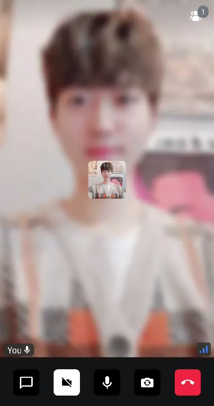
The sample above will show:

Each UI component can be customized by giving preferred values to the VideoTheme, and the VideoTheme contains various themes below:
StreamColors
StreamColors are used to represent all the colors we use and apply to our components in the SDK.
You can find the definitions of all the colors we expose in the class documentation, as well as what the default provided colors are.
You can also browse which components are using the colors, to know what will be affected by any change.
StreamDimens
StreamDimens defines different sizes that can be customized in the SDK.
You can find the definitions of all the dimensions we expose in the class documentation, as well as what the default dimensions are.
You can also browse which components are using the dimensions, to know what will be affected by any change.
StreamTypography
StreamTypography is used to apply different font weights and sizes to our textual UI components.
You can find all the text style properties we expose in the class documentation, as well as what the default styles are.
You can also browse which components are using the styles, to know what will be affected by any change.
StreamShapes
StreamShapes provides a small collection of shapes that let us style our containers.
You can find all the shapes we expose in the class documentation, as well as what the default shapes are.
These are really easy to customize, as you’ve seen before, and can make your app feel closer to your design system.
RippleTheme
Defines the appearance for ripples. The default ripple theme is StreamRippleTheme.
You can find out more about it by reading the class documentation.
You can easily customize the ripple colors in light and dark modes by overriding VideoTheme.rippleTheme with your own implementation of RippleTheme.
ReactionMapper
Maps the emoji codes that come from the reaction events, should be shown with Stream UI components.
You can find all the default emoji code map in the class documentation.
Bring Stream Themes to Your App
If you want to utilize Stream Video theme to build your application, you can easily use the theme components like the sample below:
VideoTheme {
  Box(modifier = Modifier.background(VideoTheme.colors.appBackground) {
    ..
  }
}
Each UI component is provided with CompositionLocal under the [VideoTheme], so you can efficiently use them to build your video call screen.