<FileIcon
  className="str-chat__file-icon"
  mimeType={attachment.mime_type}
  version={"2"}
/>Upgrade to v10 (theming V2)
The release v10 brings some new features as well as some breaking changes to the users. The main focus was to support the next version of theming V2 brought with @stream-io/stream-chat-css@3.0.0. It lead to addition resp. removal of some HTML elements in few components. This may invalidate some of your CSS selectors. Also, some components marked as deprecated for a longer period of time have been removed.
We have tried to introduce as few breaking changes as possible. We have not removed classes but rather added new ones that are exclusively used with the theming V2 stylesheet. Also, where possible, V1 and V2 components have been introduced for backwards compatibility (the V1 components are used unless opted into theme version 2).
Your upgrade strategy may differ based on whether you would like to make use of the new theming V2 or just do the necessary adjustments.
Changes impacting all the users
Components removed from the SDK
The following components have been removed from our code base:
- MessageCommerce
- MessageLivestream
- MessageTeam
Markup and component API changes
ChannelSearch
We have renamed the prop DropdownContainer to SearchResultsList to better reflect the purpose of the component. The search results do not have to be shown in a drop-down container.
Also, redundant setResultsOpen is not part of the type ChannelSearchFunctionParams anymore. This has impact on onSelectResult and searchFunction props
ChannelPreview
The ChannelPreviewMessenger component has received adjustments in markup - a new element to display the unread count has been added. You can target it with the class str-chat__channel-preview-unread-badge for further styling.
MessageList
The message list loading indicator is now wrapped in a div with class str-chat__list__loading so that you can target it better in your stylesheets.
You can now customize LoadingIndicator component through the Channel props.
There is a new prop head that allows you to render a custom React Element at top of the list. In the SDK it is used by the Thread component to display parent message.
VirtualizeMessageList
The default message component in virtualized Thread is now MessageSimple and not FixedHeightMessage. The FixedHeightMessage component has been deprecated and will be removed in the next release v11.
Moreover, we have added a new prop groupStyles with the same purpose as in non-virtualized MessageList.
Thread
Thread is actually a message list, but it has its own specifics. It always displays at least one message and that is the original parent message. With the release of the SDK v10, the parent message scroll behavior was unified. Now the parent message is part of the scroll container in both MessageList as well as VirtualizedMessageList. The part rendering the parent message and its separator from the rest of the replies is contained in a new component ThreadHead. You can provide your own custom implementation through a Channel prop ThreadHead. You can even override the separator by passing its substitute to the Channel prop ThreadStart.
On the other hand, the ThreadHeader component has experience markup changes. The div elements with classes str-chat__thread-header-title and str-chat__thread-header-subtitle have replaced elements strong and small in the header details. Thread now accepts two new props overrideImage (expects the image URL) and overrideTitle (expects custom title). Otherwise, the image and title are be extracted from the active channel object.
The other change (fix) brought with the release is that the thread is scrolled to the bottom when open.
EmptyStateIndicator
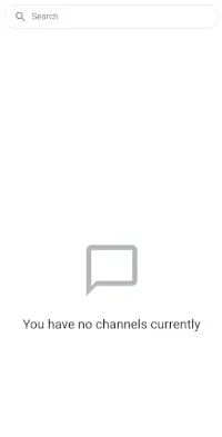
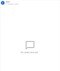
The default component used to represent empty state in message list or channel list as been enriched with an SVG image:
MessageNotifications
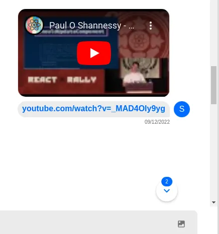
We have added a new component ScrollToBottomButton. It allows you to notify users about new messages by displaying the unread count of messages in the active message list. Besides that it also serves as a scroll-to-bottom button when a user scrolls up. The threshold that determines, whether the button should be displayed can be set via MessageList (prop scrolledUpThreshold). Default value is 200px. The VirtualizedMessageList works with the same threshold, but not configurable. You can start using this component instead of the older version by passing it to Channel prop MessageNotification.
Message
Even if you do not upgrade to theme V2, you should be aware that the message text is now grouped with message attachments into one div with class str-chat__message-bubble.
Attachment
Attachments are now rendered in a fixed order from top to bottom:
- card,
- gallery
- image
- media
- audio
- file
Another potentially breaking change is that the Card is not the default component to be rendered. If the provided attachment object is not identified as any of the above listed attachment types, its content is not rendered. The Card component is intended for display of scraped content. Remember that the attachment is now considered to carry scraped content only if it has og_scrape_url or title_link attributes. This is in order to comply with the chat API requirements.
The attachment list is newly rendered within a div with class str-chat__attachment-list.
Previous to v10 of the SDK, we used render functions to return React Elements. The render functions are now deprecated and AttachmentContainer components are used instead. This allows you to make use of all the React features while rendering different attachment types.
All the image and video attachments are now expandable to the full-screen mode. This applies to scraped media as well.
Image attachments
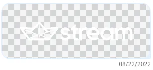
Besides that, you can expect the SVG images to be rendered on the chessboard background now:
The Image component now accepts new dimensions prop - object containing the image height and width.
Multiple images uploaded in a message are rendered within a gallery. You can newly provide your custom ModalGallery component through a prop to Channel component. ModalGallery is passed the image array and the index of the image to be displayed.
Message reactions
The Emoji in the ReactionSelector has been wrapped in a span element with class str-chat__message-reaction-emoji. It allows us to control the height and alignment of the icon. To highlight the already selected emojis you can use newly added class str-chat__message-reactions-option-selected.
The ReactionList now populates emoji tooltips with aggregated list of usernames who have already reacted with the given reaction.
We have introduced a new prop own_reactions to both ReactionSelector and ReactionList that allows us to determine, whether the user has already reacted with a given reaction.
MessageInput
The MessageInputSmall component has been now been made redundant and was deprecated. We encourage the use of MessageInputFlat UI component only.
Opting into theme V2
The majority of new features introduced with this release is bound to the use of the new theming V2. The list is as follows:
Theme
The theme should be set via Chat component prop theme. Internally it is placed on
- the container wrapping the channel search and channel list and
- the container wrapping the active channel UI
The new theming V2 provides default styles if no theme class is set. These styles are equivalent to those if class str-chat__theme-light is passed to the theme prop. If you would like to get the dark theme, you should pass str-chat__theme-dark instead.
Changes in the channel list container
ChannelSearch
The ChannelSearch component has been revamped and upgraded. It now provides richer functionality and wider possibilities of customization for those, who opt into use of theme V2. The component capabilities are described in ChannelSearch documentation in more depth
ChannelPreview
We started to use component ChannelPreview to display search results. That is why the new prop onSelect has been added to its API. You can customize what happens, when the search result is selected.
Changes in the channel pane
MessageList
We have wrapped it in a new div with class str-chat__main-panel-inner for those using theme version 2.
Message
The markup of component rendering the message with its attachments, reactions, avatar etc. has been changed specifically for theme V2. The message metadata (author, timestamp), reply button, have been moved from str-chat__message-inner one level higher to the message root div.
Attachment
The API of the Attachment component or components that render a specific content type has not changed, you should be able to upgrade seamlessly. What you have to however expect is changed markup.
File attachments
The file attachment component used for theming V2 has changed markup compared to the V2. Also, a new set of file attachment icons has been applied:
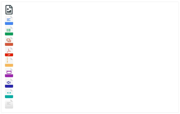
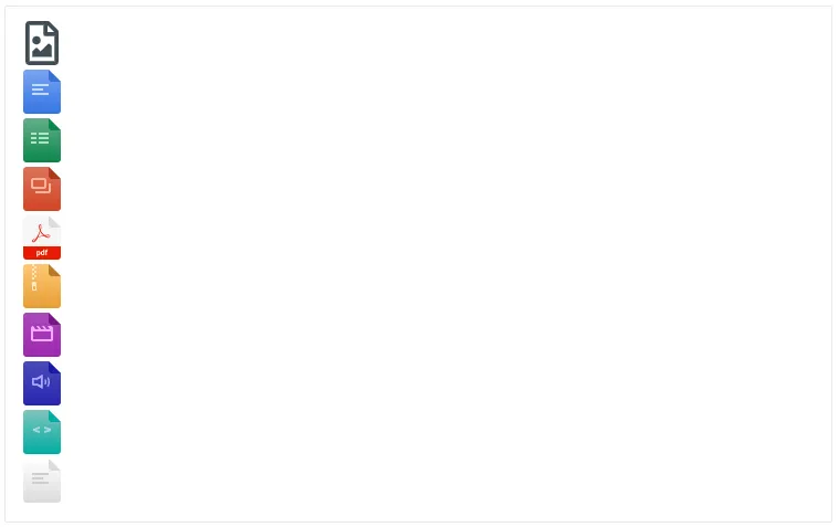
Our FileAttachment component for theming V2 uses the standard icon set. You can however use the alternative set in your custom components:
So instead of:
You can do:
<FileIcon
  className="str-chat__file-icon"
  mimeType={attachment.mime_type}
  version={"2"}
  type={"alt"}
/>
Besides that, the file attachment widgets newly display a download button (a download link).
Audio attachments
Audio attachments are rendered with a new component (with different markup) adapted to the theming V2 styles.
Scraped attachments (Card)
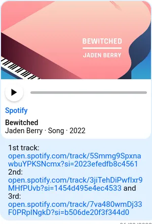
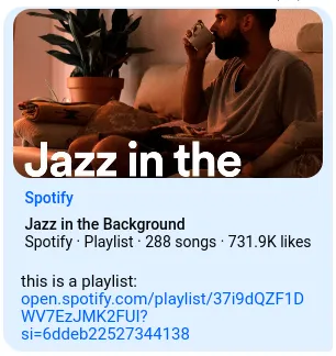
Cards now display scraped audio, video or image content:

Tooltip
Tooltip is now being rendered with the help of the PopperJS to keep the content of the tooltip in the viewport longer when the tooltip origin (could be a button) is scrolled out of the viewport bounds.
MessageInputFlat
When opting to theme V2, the integrator gets revamped message input UI component where the markup differs completely from the original.
QuotedMessagePreviewHeader has been extracted from the QuotedMessagePreview component and moved directly to the MessageInputFlat due to positioning reasons. Users will have the ability to replace this component with custom component in the future (see #1764).
EmojiPicker is now being rendered with the help of the PopperJS to keep the picker in the viewport longer when the picker origin (button) is scrolled out of the viewport bounds.
SendButton is now disabled by default if there isn’t any content to be submitted, i.e. there are no attachments or no text content.
Default UploadsPreview has been renamed to AttachmentPreviewList and is no longer imported from the package react-file-utils but instead now lives within stream-chat-react code-base. Users will have the ability to replace this component with custom component in the future (see #1299).