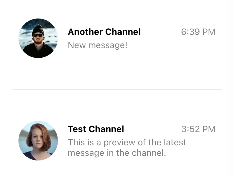
<ChannelList Preview={CustomChannelPreview} />
// Don't forget to provide filter and sort options as well!Channel List UI
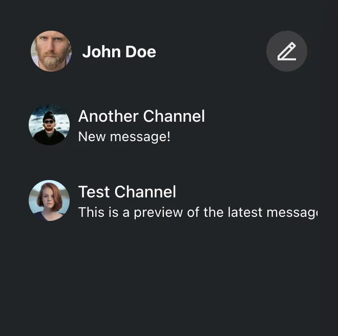
ChannelList is a primary navigation component of a chat, used to display and
switch between available channels. Due to the dynamic, real-time nature of chat,
the ChannelList component needs to subscribe to and handle many different
types of events to keep the list state up to date. This includes handling new
message events and updates to the existing ones, channel update events, channel
member presence events, and so on.
That’s a lot of work, and if done incorrectly, it’s easy to miss an important
event. That is why we always recommend building on top of the ChannelList
component provided by the SDK, even if you need to do some major customization.
Fortunately, the component itself is very flexible, and basically everything
about it can be customized. It supports
This guide takes a deep dive into these customization options.
Custom Channel Preview
You can think of a channel preview as a single item of the channel list. The preview should accurately display the current channel state and handle user interactions to switch to the selected channel.

You can customize the look and behavior of the channel previews by providing a
custom component in the Preview prop of the ChannelList component. When
rendering previews, ChannelList wraps each item with a ChannelPreview
wrapper that handles channel events such as new, updated and deleted messages.
This way, you don’t have to subscribe to these events yourself, and you can just
grab the latest state from the props instead.
Let’s implement a simple custom preview:
const CustomChannelPreview = ({
  displayImage,
  displayTitle,
  latestMessagePreview,
}) => (
  <div className="channel-preview">
    <img className="channel-preview__avatar" src={displayImage} alt="" />
    <div className="channel-preview__main">
      <div className="channel-preview__header">{displayTitle}</div>
      <div className="channel-preview__message">{latestMessagePreview}</div>
    </div>
  </div>
);
.channel-preview {
display: flex;
gap: 16px;
align-items: center;
font-size: 0.9em;
line-height: 1.2em;
}
.channel-preview__avatar {
width: 64px;
height: 64px;
border-radius: 50%;
object-fit: cover;
}
.channel-preview__main {
flex-grow: 1;
}
.channel-preview__header {
font-weight: bold;
margin-bottom: 4px;
}
.channel-preview__message {
max-height: 2.4em;
overflow: hidden;
color: #858688;
}
.channel-preview__message p {
margin: 0;
}(See also the complete reference of the available preview component props.)

The props provided to the preview component are usually sufficient to render the preview. However, if you need additional data, you can always get it from the channel state. In this next example, we will add the timestamp of the latest message in the channel:
const CustomChannelPreview = (props) => {
  const { channel, displayImage, displayTitle, latestMessagePreview } = props;
  const { userLanguage } = useTranslationContext();
  const latestMessageAt = channel.state.last_message_at;

  const timestamp = useMemo(() => {
    if (!latestMessageAt) {
      return "";
    }
    const formatter = new Intl.DateTimeFormat(userLanguage, {
      timeStyle: "short",
    });
    return formatter.format(latestMessageAt);
  }, [latestMessageAt, userLanguage]);

  return (
    <div className="channel-preview">
      <img className="channel-preview__avatar" src={displayImage} alt="" />
      <div className="channel-preview__main">
        <div className="channel-preview__header">
          {displayTitle}
          <time
            dateTime={latestMessageAt?.toISOString()}
            className="channel-preview__timestamp"
          >
            {timestamp}
          </time>
        </div>
        <div className="channel-preview__message">{latestMessagePreview}</div>
      </div>
    </div>
  );
};
.channel-preview {
display: flex;
gap: 16px;
align-items: center;
font-size: 0.9em;
line-height: 1.2em;
}
.channel-preview__avatar {
width: 64px;
height: 64px;
border-radius: 50%;
object-fit: cover;
}
.channel-preview__main {
flex-grow: 1;
}
.channel-preview__header {
display: flex;
justify-content: space-between;
font-weight: bold;
margin-bottom: 4px;
}
.channel-preview__timestamp {
font-weight: normal;
color: #858688;
}
.channel-preview__message {
max-height: 2.4em;
overflow: hidden;
color: #858688;
}
.channel-preview__message p {
margin: 0;
}
One more thing we should add is the click event handler, which should change the currently active channel. That’s easy enough to do:
const CustomChannelPreview = (props) => {
  const {
    channel,
    activeChannel,
    displayImage,
    displayTitle,
    latestMessagePreview,
    setActiveChannel,
  } = props;
  const latestMessageAt = channel.state.last_message_at;
  const isSelected = channel.id === activeChannel?.id;
  const { userLanguage } = useTranslationContext();

  const timestamp = useMemo(() => {
    if (!latestMessageAt) {
      return "";
    }
    const formatter = new Intl.DateTimeFormat(userLanguage, {
      timeStyle: "short",
    });
    return formatter.format(latestMessageAt);
  }, [latestMessageAt, userLanguage]);

  const handleClick = () => {
    setActiveChannel?.(channel);
  };

  return (
    <button
      className={`channel-preview ${isSelected ? "channel-preview_selected" : ""}`}
      disabled={isSelected}
      onClick={handleClick}
    >
      <img className="channel-preview__avatar" src={displayImage} alt="" />
      <div className="channel-preview__main">
        <div className="channel-preview__header">
          {displayTitle}
          <time
            dateTime={latestMessageAt?.toISOString()}
            className="channel-preview__timestamp"
          >
            {timestamp}
          </time>
        </div>
        <div className="channel-preview__message">{latestMessagePreview}</div>
      </div>
    </button>
  );
};
.channel-preview {
font: inherit;
border: 2px solid transparent;
border-radius: 8px;
background: none;
text-align: left;
padding: 8px;
display: flex;
gap: 16px;
align-items: center;
font-size: 0.9em;
line-height: 1.2em;
cursor: pointer;
}
.channel-preview_selected {
background: #fff;
border-color: #005fff;
cursor: auto;
}
.channel-preview__avatar {
width: 64px;
height: 64px;
border-radius: 50%;
object-fit: cover;
}
.channel-preview__main {
flex-grow: 1;
}
.channel-preview__header {
display: flex;
justify-content: space-between;
font-weight: bold;
margin-bottom: 4px;
}
.channel-preview_selected .channel-preview__header {
color: #005fff;
}
.channel-preview__timestamp {
font-weight: normal;
color: #858688;
}
.channel-preview__message {
max-height: 2.4em;
overflow: hidden;
color: #858688;
}
.channel-preview__message p {
margin: 0;
}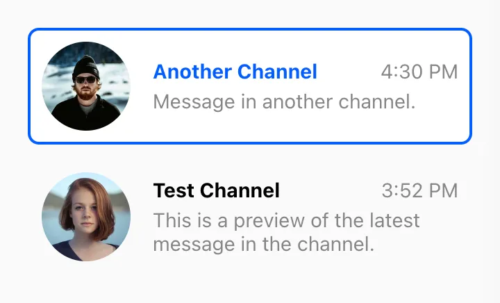
Note that we’ve also added an additional class to the preview element if its channel is currently active (we check this by comparing the id of the active channel to the id of the current channel.)
Custom Channel List Wrapper
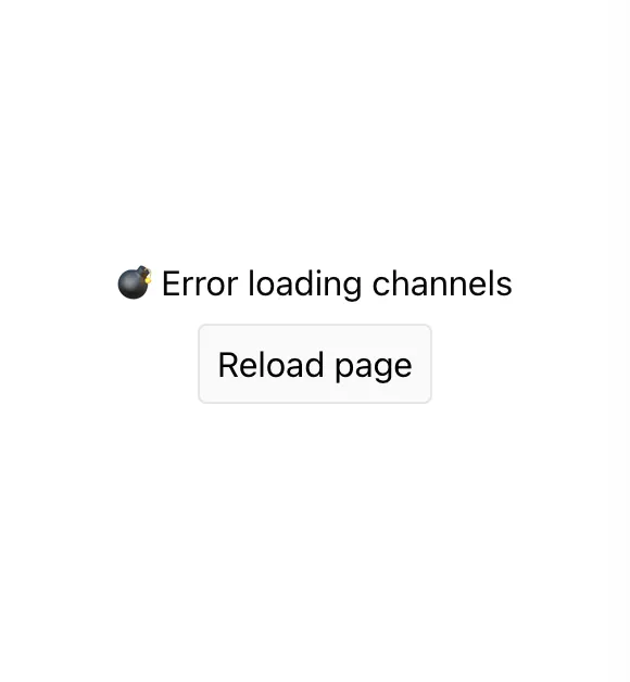
Channel list wrapper is responsible for rendering the actual items of the channel list, as well as handling the loading and error states. This is a great place to plug in your custom component if you want to have a custom loader, or to add some additional content (like header and footer) to the channel list.
You can do this by providing a custom custom component in the List prop of the
ChannelList component. It will get a bunch of props from the parent
ChannelList, including a list of loaded channels, a loading flag, and an error
object (if any).
<ChannelList List={CustomChannelList} />
// Don't forget to provide filter and sort options as well!
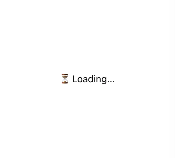
The simplest implementation of the custom channel list wrapper looks like this:
const CustomChannelList = ({ children, loading, error }) => {
  if (loading) {
    return <div className="channel-list__placeholder">⏳ Loading...</div>;
  }

  if (error) {
    return (
      <div className="channel-list__placeholder">
        💣 Error loading channels
        <br />
        <button
          className="channel-list__button"
          onClick={() => window.location.reload()}
        >
          Reload page
        </button>
      </div>
    );
  }

  return (
    <div className="channel-list">
      {loadedChannels && (
        <div className="channel-list__counter">
          {loadedChannels.length} channels:
        </div>
      )}
      {children}
    </div>
  );
};
.channel-list__placeholder {
padding: 120px 20px;
text-align: center;
}
.channel-list__button {
border: 1px solid #00000014;
outline: 0;
background: #fafafa;
font: inherit;
border-radius: 4px;
margin: 8px;
padding: 8px;
cursor: pointer;
}
.channel-list__button:focus {
border-color: #005fff;
}

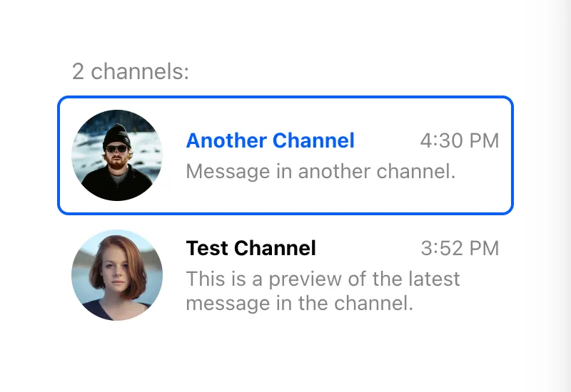
If you need access to the array of channel objects, you can use the
loadedChannels prop. Keep in mind, however, that it can update frequently,
resulting in excessive rendering. For this reason, you have to explicitly opt-in
by setting the sendChannelsToList prop on the ChannelList:
<ChannelList List={CustomChannelList} sendChannelsToList />;
// Don't forget to provide filter and sort options as well!

const CustomChannelList = ({
  loadedChannels,
  children,
  loading,
  error,
}: React.PropsWithChildren<ChannelListMessengerProps<StreamChatGenerics>>) => {
  if (loading) {
    return <div className='channel-list__placeholder'>⏳ Loading...</div>;
  }

  if (error) {
    return (
      <div className='channel-list__placeholder'>
        💣 Error loading channels
        <br />
        <button className='channel-list__button' onClick={() => window.location.reload()}>
          Reload page
        </button>
      </div>
    );
  }

  if (loadedChannels?.length === 0) {
    return <div className='channel-list__placeholder'>🤷 You have no channels... yet</div>;
  }

  return (
    <div className='channel-list'>
      {loadedChannels && (
        <div className='channel-list__counter'>{loadedChannels.length} channels:</div>
      )}
      {children}
    </div>
  );
};
.channel-list__placeholder {
padding: 120px 20px;
text-align: center;
}
.channel-list__button {
border: 1px solid #00000014;
outline: 0;
background: #fafafa;
font: inherit;
border-radius: 4px;
margin: 8px;
padding: 8px;
cursor: pointer;
}
.channel-list__button:focus {
border-color: #005fff;
}
.channel-list__counter {
color: #858688;
margin: 0 10px 8px;
}
Custom Channel List Renderer
By default, the ChannelList component provided by the SDK renders channel
previews in the same order as the channels were queried. If you want to hook
into the list rendering process, e.g. to add subheadings, group channels, etc.,
you can provide a custom list renderer in the renderChannels prop of the
ChannelList component.
The function passed in this prop takes a list of loaded channels and a channel
preview component. Note that it is not exactly the component passed in the
Preview prop, but rather a version of that component wrapped with the
ChannelPreview helper to ensure that all channel event listeners are set up
properly. The renderChannels function is only called if the channel list was
successfully loaded and is not empty.
This example adds a separator between read and unread channels:
const renderChannels = (channels, getChannelPreview) => {
  const unreadChannels = [];
  const readChannels = [];

  for (const channel of channels) {
    const hasUnread = channel.countUnread();
    (hasUnread ? unreadChannels : readChannels).push(channel);
  }

  return [unreadChannels, readChannels]
    .filter((group) => group.length > 0)
    .map((group, index) => (
      <div key={index} className="channel-group">
        {group.map((channel) => (
          <div key={channel.id}>{getChannelPreview(channel)}</div>
        ))}
      </div>
    ));
};
.channel-group + .channel-group {
padding-top: 40px;
margin-top: 40px;
border-top: 2px solid #00000014;
}