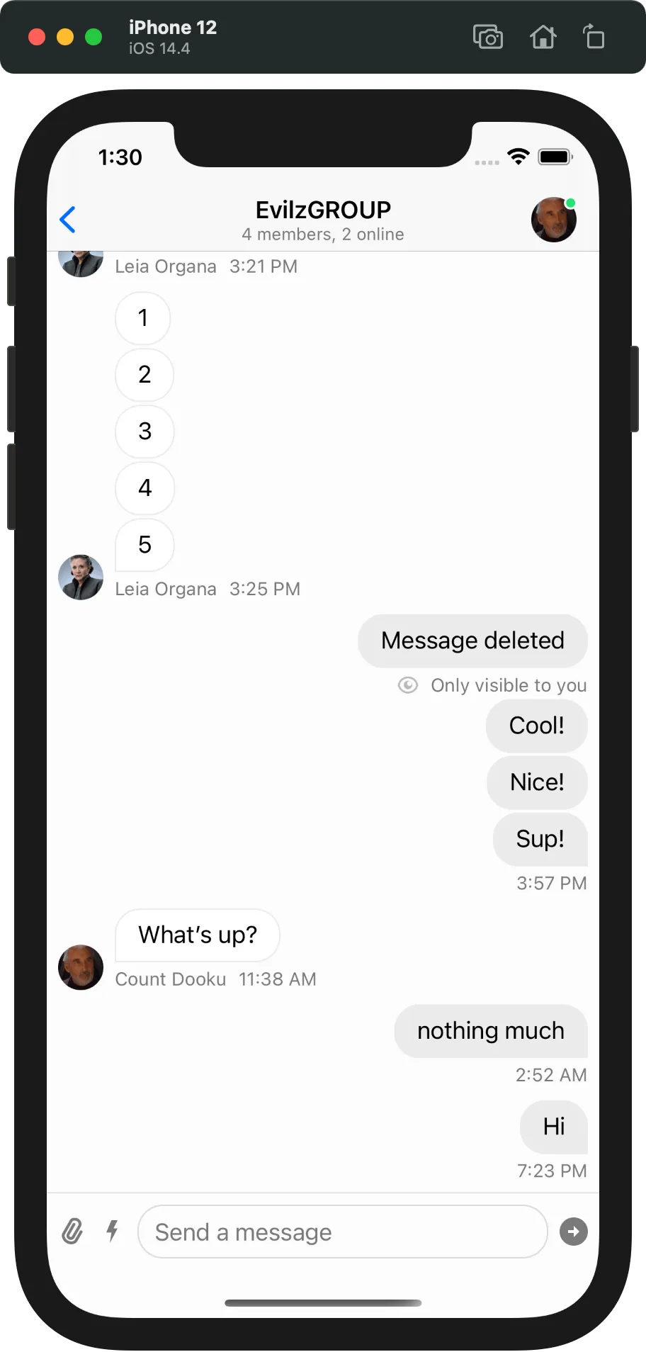
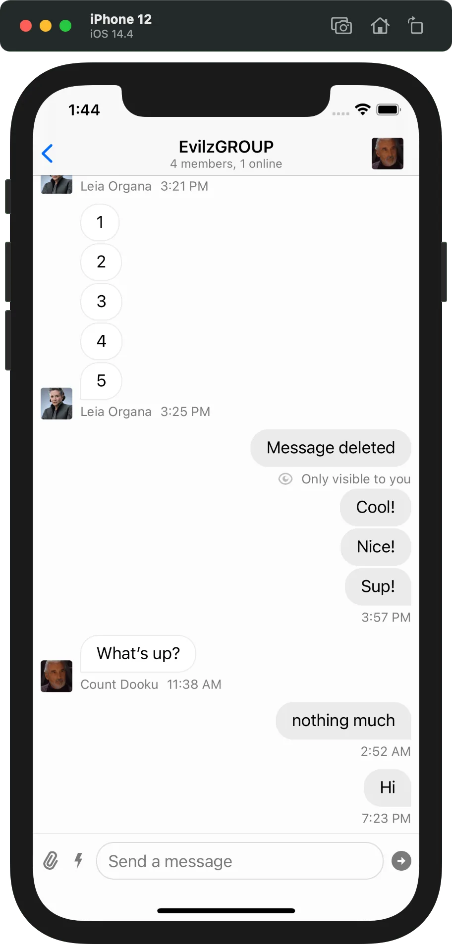
Components.default.avatarView = MyChatAvatarView.selfChatAvatarView
This component renders the user avatar. By default, a circular image is used.
Customization
You can swap the built-in component with your own by setting Components.default.avatarView to your view type.
You can find more information on how the components configuration works here.
Examples
Square Avatar
First, create a subclass of ChatAvatarView and set it according to your needs.
final class SquareAvatarView: ChatAvatarView {
    override func layoutSubviews() {
        super.layoutSubviews()
        imageView.layer.cornerRadius = 3
    }
}
Next, you need to set this custom view to Components in the context where your customization takes place.
Components.default.avatarView = SquareAvatarView.self| Default avatars | Square avatars |
|---|---|
 |
On this page:
